
Scan and Summarize Tables with Confluent Cloud for Apache Flink
Confluent Cloud for Apache Flink® provides graphical tools in your workspaces that enable scanning and summarizing data visually in Flink tables. Distributions of values for each column in a table are shown in embedded charts, or sparklines. You can highlight values in one chart to filter corresponding values in all columns, revealing connections and relationships in your data.
Overview
When you explore data in a table, you frequently want to find a row (scan) or to understand the shape of the data (summarize).
Scan
Cloud Console workspaces provide a search box that enables scanning the data for particular rows. For example, if you’re interested in the orders that are placed by a particular customer, you can enter the customer’s ID in the search box to scan the table for relevant rows.
Summarize
In a Cloud Console workspace, when you run a Flink SQL statement that returns a table, sparklines are displayed automatically and show the distribution of distinct values in each column. These charts update automatically as new rows arrive from the data stream.
The workspace enables filtering rows by interacting with these charts. For example, in an orders table, you can apply a filter that shows only rows for low-price items and compare these results with another filter that shows high-price items to see if there’s a different distribution of items between the price ranges.
Prerequisites
You need the following prerequisites to use Flink in Confluent Cloud Console.
Access to Confluent Cloud.
Explore example data
Log in to the Confluent Cloud Console and navigate to an environment that hosts Flink SQL.
In the navigation menu, click SQL workspaces to open the workspaces page.
If you have a workspace set up already, click its tile, or click Create workspace to create a new one.
In the workspace, use the Catalog and Database dropdown controls to select the examples catalog and the marketplace database.
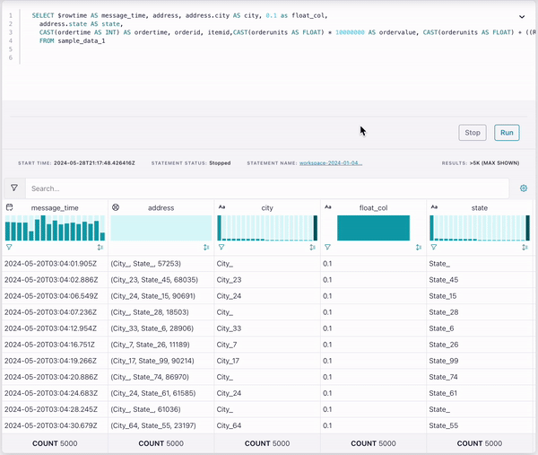
Run the following statement to query the orders stream for all rows.
SELECT * FROM orders;
Your output should resemble:
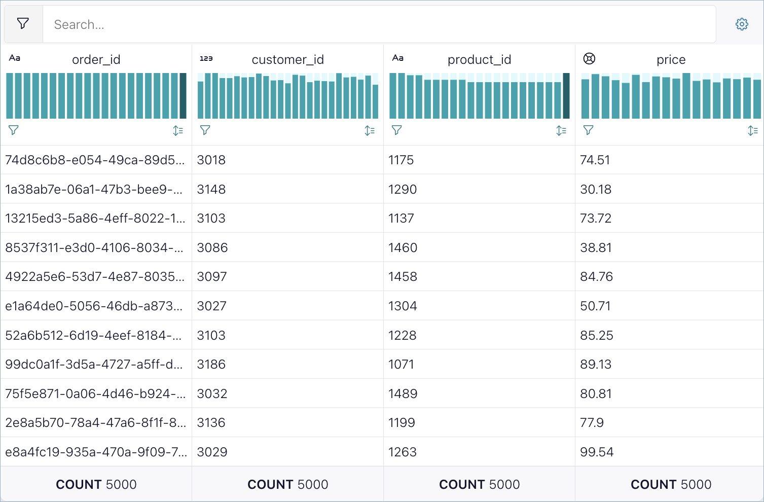
A chart appears at the top of each column. The charts update as new rows stream into the query results. Each chart shows the distribution of distinct values in the column, for strings, booleans, numbers, and categories. An icon shows the data type of the column. The arrow icon sorts rows by the column values.
Aggregated values at the bottom of each column summarize aspects of the data in the column, such as the count of rows and the number of distinct values, or cardinality. For columns with numerical values, you can see statistics such as the average, minimum, and maximum values.
The query displays a maximum of 5000 rows or the LIMIT value you specify in your query. For example, the following statement limits the query result to 50 rows.
SELECT * FROM orders LIMIT 50;
At the bottom of the price column, change the dropdown control from Count to Average.
The average value of the most recent prices displays and updates as new rows arrive.
Select other statistics for prices, like Max and Min.
Search for values
The search box enables finding values across all columns in the currently displayed result set.
The search box doesn’t filter the data. It’s useful for scanning for a particular row or narrowing the results down to a particular row.
In the search box, type “3000”.
Only rows with a customer_id value of
3000appear, which lets you view all orders from this customer.Click x in the search to clear it.
In the search box, type “1000”.
Only rows with a product_id value of
1000appear, which lets you view all orders for this product.Click x in the search box to clear it.
In the search box, type “3050”, and in the price column, click the double-arrow icon.
Only rows for customer
3050appear, sorted by price from lowest to highest.In the price column, click the arrow icon.
Only rows for customer
3050appear, sorted by price from highest to lowest.Click x in the search box to clear it, and click the arrow icon in the price column to reset the rows to unsorted.
Apply a filter
Any column that has numerical or datetime data is filterable. Filters apply across all columns in the table.
Filters apply only in the graphical display and don’t affect the underlying data stream.
Hover over the leftmost bar in the price chart.
The cursor changes to a + target, and a summary of the rows represented by the bar appears in a popup.
Click and drag, or brush, the cursor over the first three bars in the price chart.
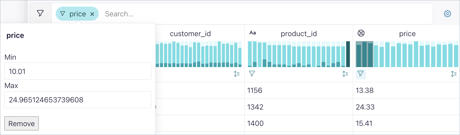
The filter restricts the price data so only rows with prices in the selected range appear. This filter shows the orders for the least expensive products.
When you apply a filter, the unfiltered data appears in gray.
Above the charts, the current filter appears. Click the filter to view and adjust its settings.
You can apply more than one filter. In the customer_id chart, brush the first three bars.
The filter restricts the customer data. In conjunction with the filter you applied already to the price data, the rows show the least expensive products ordered by customers with IDs between 3000 and 3029, inclusive.
Click x in the filters to clear them.
View changes over time
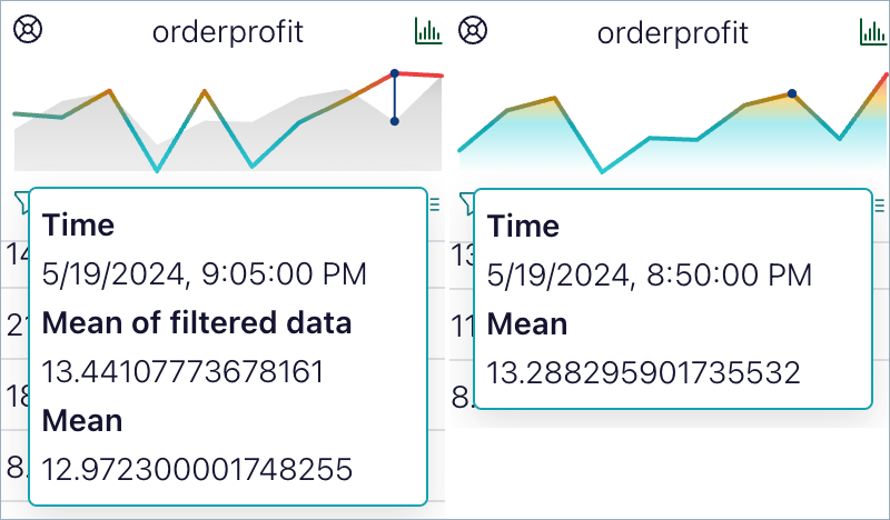
If your data contains a datetime column, each numerical column also offers a chart that shows the average value over time. If you filter the data, the unfiltered average value also appears for context. Hover over the chart for exact values.