
View Time Series Data with Confluent Cloud for Apache Flink
Confluent Cloud for Apache Flink® enables visualizing time-series data in real time. The output of certain SQL statements renders as a time-series chart. Whenever a statement’s output has at least one time column and at least one numeric column, the workspace charts the output automatically in a time-series graph when you toggle to chart mode.
You can further customize charts interactively: choose a different x-axis column, add multiple series, change the chart’s time granularity, or filter the overall time range.
Prerequisites
You need the following prerequisites to use Flink in Confluent Cloud Console.
Access to Confluent Cloud.
Step 1: Open a workspace
Log in to Confluent Cloud Console at https://confluent.cloud/login.
In the navigation menu, click SQL workspaces to open the workspaces page and select or create a workspace.
Use the Catalog and Database dropdown controls to select the examples catalog and the marketplace database.
Step 2: Generate time-series data
Run the following statement to generate three time-series signals.
SELECT $rowtime AS row_timestamp,
   RAND() * 0.10 * SIN(0.10 * UNIX_TIMESTAMP() + 0) AS series1,
   RAND() * 0.10 * SIN(0.10 * UNIX_TIMESTAMP() + 1.1e3) AS series2,
   RAND() * 0.03 * SIN(0.10 * UNIX_TIMESTAMP() + 1.2e3) AS series3
FROM orders;
Step 3: View time-series data
Click the time-series toggle (
 ) to open the time-series visualizer.
Your output should resemble:
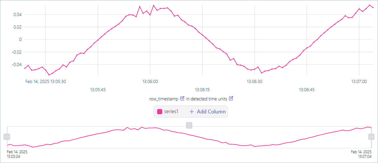
The upper pane shows the series1 signal.
The lower pane enables scrolling through the data as it streams through the visualizer.
On the right side of the lower pane, click
 and drag it to the left. On the left side of the lower pane, click and drag it to the right.
These gestures define the width of the view window that displays in the upper pane.
Click
 and drag it to the right.
The view in the upper pane adjusts to display the data within the window.
As data continues to stream, the window in the lower pane moves to the left, while the display in the upper pane remains centered on the data selected in the window.
Double-click
to reset the view.Click Add Column, and in the context menu, select series2 and series3 to display the other signals.
Click
 to download the current visualization as a PNG file.
Click the time-series toggle (
) again to close the visualizer.